JUMPLINKS
1. LECTURES
2. INSTRUCTIONS
3. PROJECTS
4. REFLECTIONS
LECTURES
Mr. Fauzi explained the way to use adjustment layers to enhance the color of the objects on our collage.
1. What is Adjustment Layers?
Adjustment layers are non-destructive image editing tools that are very useful for adjusting tone and color without permanently changing the pixels on a certain image. This feature is a must know since it will make our workflow on Photoshop more flexible and efficient.
 |
| Fig. 1.1, Adjustment layers, (21/10/24) |
2. Types of Adjustment Layers
- Brightness/Contrast is for adjusting highlights (brightness) and shadows (contrast) of an image.
- Levels adjust the the tonal values of an image by adjusting the levels of shadow, midtones and highlights.
- Curves is the most powerful and precise tool for editing since it allows you to adjust as many points as you want throughout the tonal range of an image.
- Exposure lets you adjust exposure through 3 sliders: Exposure (highlights), Offset (midtones), and Gamma (dark tones).
- Selective Color selectively modifies the amount of primary color without affecting the other colors.
 |
| Fig. 1.2, Types of adjustment layers, (21/10/24) |
INSTRUCTIONS
PROJECTS
Digital Collage

|
| Fig. 3.1, Best composition |
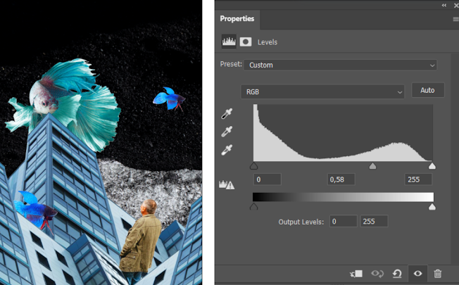
First of all, I made the background darker to make it look like a night sky. This can be achieved by creating an adjustments layer and tweak the levels.
 |
| Fig. 3.2, Levels, (21/10/24) |
I did a change on the color and also decreased the saturation on the buildings using the adjustment layers. This is for highlighting other objects on the image.
 |
| Fig. 3.3, Hue/Saturation, (21/10/24) |
Since I imagined the fish on the collage as some sort of divine beings, I made the big and small fish glow to emphasize the surreal aspect of the collage.
 |
| Fig. 3.4, Curves, (21/10/24) |
Lastly, I add a noise filter on top of everything to add a grainy texture to the collage. This is the finalized version of my digital collage:

|
| Fig. 3.5, Best composition (Color Adjusted) |
REFLECTIONS
This week, we have learned a lot about adjustment layers. I finally understand how colors can change an atmosphere of an image drastically. I also realized that storytelling can be achieved just by changing and playing with the composition and colors.
Comments
Post a Comment