Samuel Keane / 0376236
Task 1: Exercises 1 & 2
JUMPLINKS
3. TASK
LECTURES
Lecture 1: AdTypo_1_Typographic Systems
"Typographical organization is complex because the elements are dependent on communication in order to function." (Elam, 2007). Which means, if there is 0 communication, there is no point of it being there. Elam also stated that the typographic systems are similar to what architects call shape grammars since the systems also has a set of rules that is unique that focuses and directs the decision making.
As stated by Kimberly Elam in 2007, there are 8 major variations with infinite numbers of permutation. The 8 permutations consists of:
Axial System: The informations are divided into groups and organized to the left or right on a single axis. The axial does not necessarily have to be straight, it can bend.
Radial System: Elements are extended from a particular point of focus.
Dilatational System: All elements expand from a central point in a circular manner. Information can be placed in a hierarchial order where the most important can be put in the center while the lesser is put on the outer rings, vice versa.
Random System: Elements appears to have no specific pattern or relationship.
Grid System: A system consists of veritcal and horizontal divisions. Usually information is structured according to the different grids.
Transitional System: An informal system of layered banding, basically segregating information within bands.
Modular System: A series of non objective elements that are constructed in as a standardized unit.
Bilateral System: All text are arranged symmetrically on a single axis.

|
| Fig. 2.1, 8 Typographic systems, Week 1, (21/04/25) |
Lecture 2: AdTypo_2_Typographic Composition
Examples of Principles of Design Composition
1. Emphasis

|
| Fig. 2.2, Emphasis, Week 2, (02/05/2025) |
2. Rule of Thirds

|
| Fig. 2.2, Rule of Thirds, Week 2, (02/05/2025) |
Typographic Systems
1. Swiss Grid (Modernist)
An enhanced version of the grid system, with Josef Muller Brockmann, Jan Tschichold, Max Bill, etc. as the proponents, it adds elements of excitement and engagement to the seemingly rigid structure while maintaining a certain amount of play.

|
| Fig. 2.3, Swiss Grid, Week 2, (02/05/2025) |
In the post-modernist era of typography, chaos, randomness and asymmetry was explored. There was a method to its madness which is exciting and new.

|
| Fig. 2.4, Post-modernist, Week 2, (02/05/2025) |
1. Environmental Grid
Based on the exploration of an existing or a combination of structures, Environmental grid combines curves and lines from it and organize information around the formed super-structure.

|
| Fig. 2.4, Environmental Grid, Week 2, (02/05/2025) |
2. Form & Movement
System created by Mr. Vinod, it visualizes pages as frames by putting static forms on a spread as an animation to ensure visual connection and surprise in between pages. The forms could represent image, text, or color. As more elements were added to the forms, complexity will increase as more of them take shape.

|
| Fig. 2.5, Form & Movement, Week 2, (02/05/2025) |
Lecture 3: AdTypo_3_Context & Creativity
The first actual writing system, cuneiform, has a distinctive wedge which was a result of pressing the blunt end of a reed stylus into wet clay tablets.
- Ideograms, represent the things they actually depict.
- As determinatives to show that the signs preceding are meant as phonograms and to indicate the general idea of the word.
- As phonograms to represent sounds that "spell out" individual words.
.png)
|
| Fig. 2.6, Cuneiform & Hieroglyphs, Week 3, (09/05/2025) |
Roman Uncials: It became more and more rounded by the 4th century.
English Half Uncials (8th C.): In England, the uncial evolved into a more slanted and condensed form.
Carolingian Minuscule: Capitals at the start of a sentence, spaces between words and punctuation.
Black Letter (12-15 C. CE): Gothic writing form reflected this writing. It is characterized by tight spacing and condensed lettering.
.png)
|
| Fig. 2.7, Letterform evolution, Week 3, (09/05/2025) |
Eastern developments in handwriting
%20(1).png)
|
| Fig. 2.8, Left: evolution of middle eastern characters; right: evolution of Chinese characters, Week 3, (09/05/2025) |

|
| Fig. 2.9, Indus scripts. (09/05/2025) |
Lecture 4 - AdTypo_4_Designing Type
According to Xavier Dupre in 2007, the purpose of designing another typeface is because
- type design carries a social responsibility so one must continue to improve its legibility
- it is a form of artistic expression
Frutiger, his name sake, is a typeface created in 1968 for the newly built Charles de Gaulle International Airport.
Purpose: to be a clean and distinctive and legible typeface that can be seen from close and far.
Limitations: letterforms still need to be recognized even in poor light conditions or when reader pass the sign quickly.

|
| Fig. 2.10, Univers and Frutiger, Week 4 (16/05/2024) |
Matthew Carter mostly create fonts to address technical challenges, like Verdana for Microsoft.
Purpose: this font was made to be legible even on small screens.
Limitations: Verdana has some characteristics that comes from the pixels rather than ink.
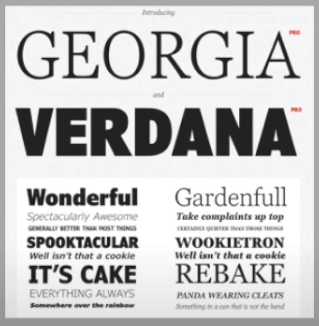
|
| Fig. 2.11, Georgia and Verdana, Week 4 (16/05/2024) |

|
| Fig. 2.12, Bell Centennial, Week 4 (16/05/2024) |
Purpose: to create a bold typeface that is simple for the signage on the underground railway. He combined classical Roman proportions and humanist.
Limitations: to make traditional calligraphy appear simple and elegant.
Construction and Considerations

|
| Fig. 2.12, Alphabet constructions, Week 4 (16/05/2024) |
INSTRUCTIONS
TASK
TASK 1: Exercise 1 - Typographic System
For exercise 1, we were tasked to create 8 typographic posters with the formula of the 8 typographic systems given. The posters should be made using Adobe InDesign. We were then instructed to choose one headline out of three provided headlines. This is what I chose and what I will be working on.
Taylor’s University
All Ripped Up: Punk Influences on Design
Open Public Lectures:
June 24, 2021
Lew Pik Svonn, 9AM-10AM
Ezrena Mohd., 10AM-11AM
Suzy Sulaiman, 11AM-12PM
June 25, 2021
Lim Whay Yin, 9AM-10AM
Fahmi Reza, 10AM-11AM
Manish Acharia, 11AM-12PM
Lecture Theatre 12
These are the requirements for the poster:
- Canvas must be in 200 x 200 mm
- Artwork must be in black, with 1 extra color
- Graphical elements can be used but limitedly
First Attempt
1. Axial
I decided to use an arrow pointing upwards as the axis. I made two versions of these, but ended up using the second.
.png)
|
| Fig. 3.1, Axial, Week 2, (28/04/2025) |
2. Radial
For radial, I decided to use elements of punk on the graphics, I ended up with 2 versions, one with the graphics and one without.
.png)
|
| Fig. 3.2, Radial, Week 2, (28/04/2025) |
3. Dilatational
At first, I tried to make the text looked like a vinyl record. However, I realized that it was too distracting, so I decided to not use any color.
.png)
|
| Fig. 3.3, Dilatational, Week 2, (28/04/2025) |
4. Random
For this system, although not quite, I tried to imagine a schizophrenic creating this poster, here is what I came up with.
.png)
|
| Fig. 3.4, Random, Week 2, (28/04/2025) |
5. Grid
Although it looks simple, I feel like I had the hardest time on making this one.

|
| Fig. 3.5, Grid, Week 2, (28/04/2025) |
6. Modular
Nothing really deep happens here, just a simple and clean modular system typographic poster.

|
| Fig. 3.6, Modular, Week 2, (28/04/2025) |
7. Transitional
I tried to keep things simple by minimizing graphical elements.
.png)
|
| Fig. 3.7, Transitional, Week 2, (28/04/2025) |
8. Bilateral
.png)
|
| Fig. 3.8, Bilateral, Week 2, (28/04/2025) |
Revisions
After receiving feedbacks from Mr. Vinod, I made a few changes to them.
1. Grid
The margin on it was messed up, so I had to rearrange the text again. Also, the red on the bottom was too distracting, it became problematic since it messes with readers focus to the text. Here is what I ended up making.

|
| Fig. 3.9, Grid revised, Week 3, (01/05/2025) |
2. Bilateral
For my bilateral poster, I was told to pay attention and do some adjustments to paragraph spacing and the leading, so what I did was I re-adjusted those.

|
| Fig. 3.10, Bilateral revised, Week 3, (01/05/2025) |
Finalized Versions

TASK 1: Exercise 2 - Type & Play
Extraction
I wanted to use images relating to things I like, so I decided to choose a grilled cheese pull. I started by looking at images on Pinterest and this is the image I decided to work on.

|
| Fig. 3.11, Reference photo, Week 3, (05/05/2025) |
Then, I went to Illustrator to trace the possible letters on the image. In this case, I decided to go for the negative space between the pulls. I use pen, direct selection, curvature and line tool for tracing the letters, but mainly curvature. In this image, I found a possible letter of A, B, C, D, and O.

|
|
Fig. 3.12, Extracting process, Week 3, (05/05/2025) |

|
| Fig. 3.13, Extracting results, Week 3, (05/05/2025) |
Digitization
I am trying to find a middle ground for the traced shapes and the font. Basically, a serif font with a cheese pull texture in between the strokes and the counters of the alphabet. Here is what I sketched as a rough idea for the letters.
.png)
|
| Fig. 3.14, Sketch, Week 3, (05/05/2025) |
.png)
|
| Fig. 3.15, Digitalization process, Week 3, (05/05/2025) |
This is the finalized version of the font.

|
| Fig. 3.16, Final letterforms, Week 3, (05/05/2025) |
Poster
I decided to find another image of grilled cheese on the internet. I also added mock logos on the bottom along with a template credit block I downloaded online.
.png)
|
| Fig. 3.17, Used photo & logos, Week 4, (09/05/2025) |
With that, I hop on Illustrator and turn these logos into path so I can change the colors of these logos easier by using the image trace feature.

|
| Fig. 3.18, Image trace, Week 4, (09/05/2025) |
Then, I put them all together in Photoshop, except for the font itself. Here is how I do it.

|
| Fig. 3.19, Photoshop process, Week 4, (09/05/2025) |

|
| Fig. 3.20, Direct selection, Week 4, (09/05/2025) |
After a few adjustments and refinements on the font, here is how the poster ended up looked like.

|
| Fig. 3.21, Poster, Week 4, (09/05/2025) |
I also made two other versions, one with yellow title, one with red. For the yellow poster I tried using outer glow on the letters to make it pop.
.png)
|
| Fig. 3.22, Yellow & red poster, Week 4, (09/05/2025) |

|
| Fig. 3.23, Horror mock movie poster, Week 4, (09/05/2025) |

|
| Fig. 3.24, Final mock movie poster, Week 4, (14/05/2025) |
Final Output

|
| Fig. 3.25, Final letter extraction, Week 5, (18/20/2025) |

|
|
Fig. 3.26, Overall process, Week 5, (18/20/2025) |

|
|
|

|
| Fig. 3.28, Final mock movie poster, Week 5, (18/20/2025) |
FEEDBACKS
Week 2
General Feedbacks
Avoid extreme angles and paying attention to margin is important.
Specific Feedbacks
Graphics that are too distracting are problematic as it disturbs readers focus from the actual information, every text needs to be inside the margin. For the bilateral system work, check line spacing and leading of the text.
Week 3
General Feedbacks
Pay attention to the details of the image you are extracting the letters from.
Specific Feedbacks
There is currently no problem with my work.
Week 4
General Feedbacks
Information presented needs to be readable. Do not treat it as decorations. Also, make sure to set margin before working on a layout.
Specific Feedbacks
Instead of going for a horror aesthetic, make it fit the theme of the cheese more.
REFLECTIONS
Experience
I thought starting this module, advance typography, was easy at first since we have basically learned this module on the last semester. But, just like usual, dealing with text and words is not very easy to do. Especially on exercise 1, we have so little time to work and we are also told not to use graphics that are too distracting. Exercise 2 is more laid back, although it had its fair share of complexity. I was struggling on finding the right image to use, but thankfully I managed to finish my work.
Observations
I observed so many possible letterforms on nature. From palm trees to the cracks on the concrete can be used as inspiration for creating an art, not only for typography.
Findings
I learned that setting margins is important. Also, every detail like text and image placement on an artboard can be very crucial. Just from a placement of a dot can direct the attention of readers easily.
FURTHER READING
Week 1 - Typographic Systems by Elam, K.
After memorized and learned about the 8 typographic systems from the first lecture by Mr. Vinod, I decided to dive into the systems further.
Constrains & Options
Typographic constrains and options provides the chance for rich yet subtle variations. Every lines of message must be used. But, lines may be broken at will to change a single line into multiple lines. This creates changes in grouping and the way in which the line is read.

|
| Fig. 6.1, Line breaks, leading, and word & letter space, Week 2 (02/05/2025) |
Grouping
Grouping simplifies the composition and enhances readability which is important for typography.
.png)
|
| Fig. 6.2, Grouping, Week 2 (02/05/2025) |
Week 2 - Kreatif Beats - Finding Type: A Novel Typographic Exercise by Mr. Vinod
To work on the task "Finding Type," There are a few steps need to be followed in order to achieve satisfying results. The photo of the object also needs to have strong characteristics, preferably a repetitive nature.
1. Finding an Image
If an image has too many different elements, extraction would be inconsistent and would make the process very complicated.

|
| Fig. 6.3, Finding image, Week 2 (03/05/2025) |
2. Deconstruction of an Image
The important part of the deconstruction is to study the nature of the shapes and forms of the object that is used.

|
| Fig. 6.4, Deconstructing image, Week 2 (03/05/2025) |
3. Identifying Letterforms
After deconstruction was done, it is time to identify any possible letterforms within the outline ideas.

|
| Fig. 6.5, Identifying letterforms, Week 2 (03/05/2025) |
Week 3 - Kreatif Beats - Finding Type: A Novel Typographic Exercise by Mr. Vinod
4. Extracting Letterforms
Then, the letterforms are extracted and placed on the baseline to identify the characteristics and direction.

|
| Fig. 6.6, Extracting letterforms, Week 3 (05/05/2025) |
5. Identifying a Reference Typeface
The reference is used for guiding the direction of the letterforms to a certain aesthetic, which also serves as a point of reference when deciding the shape and form of the letter.

|
| Fig. 6.7, Identifying a Reference Typeface, Week 3 (05/05/2025) |
6. Refining Letterforms
The goal on this step is to find a middle ground between the extracted letterforms and the reference typeface. Refine the letterform to a point it is consistent, uniform, and stylistically the same with the other letterform.

|
| Fig. 6.8, Refining letterforms, Week 3 (05/05/2025) |
Week 4 - Typographic Systems by Elam, K.
The Circle & Composition
Circle is a wildcard element, meaning it can be used in almost anywhere
in the composition. It has a lot of function, such as weight compositions,
gives the designer the tool to guide the eye, creates a pivot point,
tension and emphasis. It also contributes to visual organization or
balance.

|
| Fig. 6.9, Usage of circles, Week 4 (15/05/2025) |
This book actually turns out to be quite interesting. It also helps me understand the usage of text and shapes even further. I would read this book again in the future as I strive to learn more about typography and the theories revolving this subject.
This comment has been removed by the author.
ReplyDelete